Guidelines for Effective Interfaces

Subscribe to Toloka News
Subscribe to Toloka News
Every day, there are tens of thousands of people using Toloka to perform wide-ranging tasks, from labeling data to transcribing audio and comparing sites. Each task has its own customized interface, which is how the toloker sees the task and interacts with it. The clarity and quality of the interface can affect how many people will respond to a given task, and how quickly and effectively they will complete it.
We have compiled a set of guidelines for effective interfaces. These guidelines will help you:
- Improve the task rating and speed up task completion
- Process more data
- Get better results
- Spend less time on quality control
- Save money
Task features
UX/UI design standards are applicable to Toloka interfaces. Try to put yourself in the shoes of the user. As a requester, your challenge is to help users perform repetitive actions quickly and efficiently, while limiting the likelihood of errors. Focal points to keep in mind:
- A large selection of tasks. In Toloka, performers can choose from hundreds of tasks. They may spend a lot of time doing tasks that they enjoy.
- Speed. Performers earn money based on the number of tasks they complete, so they try to submit them as quickly as possible.
- Monotony. Most tasks involve repeating the same actions over and over.
- Concentration. Tasks require concentration. An inattentive user will make mistakes and will be blocked by the quality control system.
Interface elements
Let's be sure we're clear on terminology. We'll start with a basic example: evaluating a joke. The task interface consists of 4 main components:
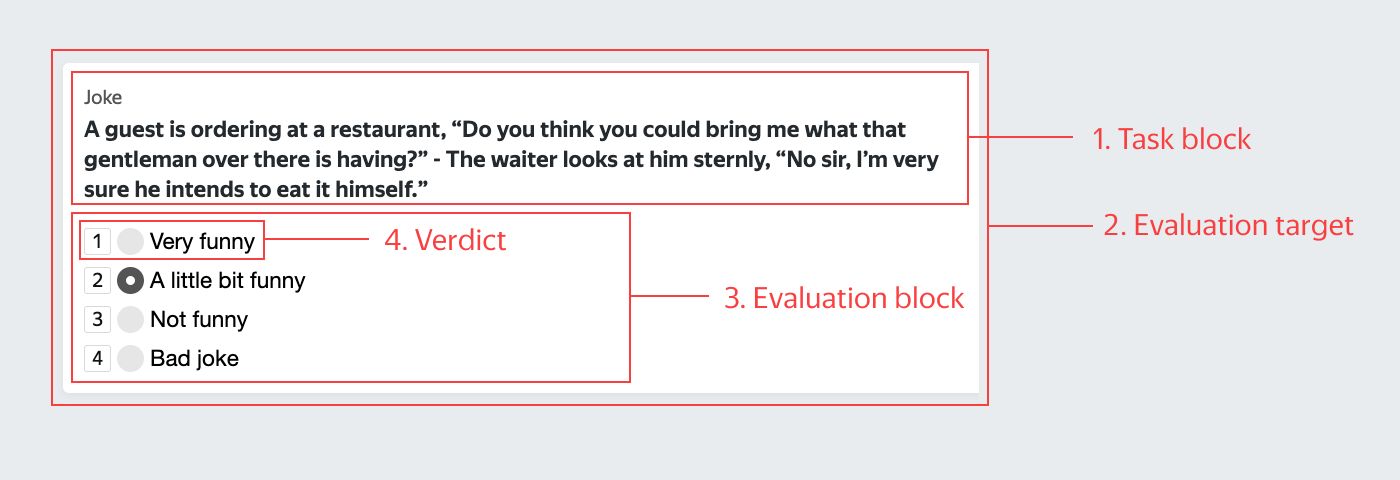
- Task block — The area that combines the other elements.
- Evaluation target — What needs to be evaluated.
- Evaluation block — The area with the evaluation scale.
- Verdict — The score selected by the user.
Rule No. 1 Cross-platform compatibility
Many users access Toloka from mobile devices. If your task is displayed correctly on smartphones, more people will see it and complete it, which translates to faster results. In order for the task to be accessible on mobile devices, you need to specify a user filter in the pool settings: "Client = Toloka web version or Mobile Toloka".
Limitations
Not all tasks work well on mobile devices. Some types of data are difficult to label correctly on a small screen. One example is object selection in an image. Consider a task in which users need to mark road signs. On a computer screen, it is easy to select a road sign using the mouse.
Object selection in an image using the web version of Toloka:
On a small screen in a mobile browser, this is not an easy task. If a performer opens this project in the mobile app, they will see a blank screen instead of the task. Object selection in an image using a mobile browser:
Audio and video may work differently depending on operating system and file format. For example, let's take a task to evaluate sound quality in which the performer is given files in several different formats. Some formats will play in both the app and the browser, while others will play only in the browser, causing different performers to score them inconsistently.
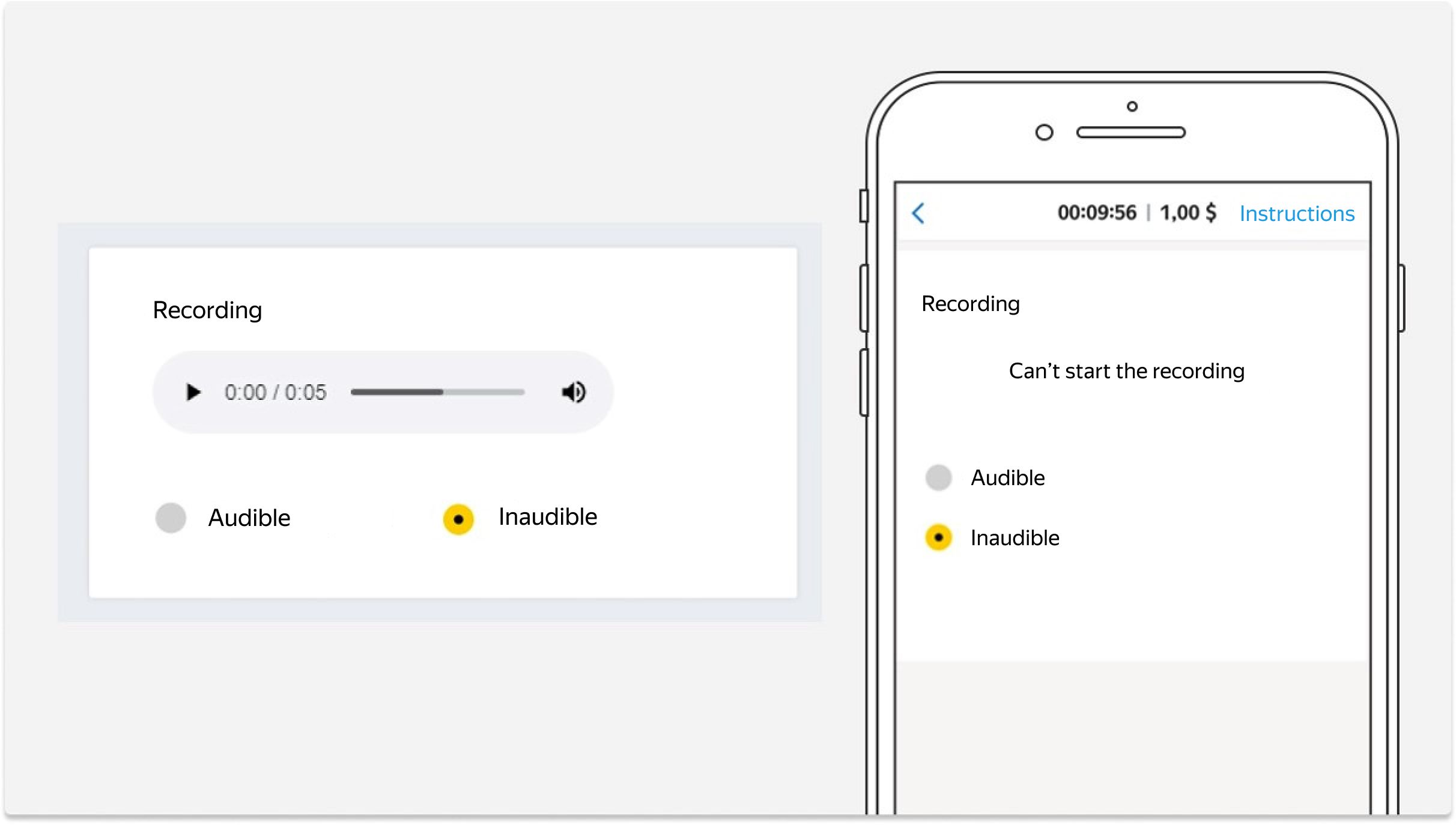
This is why it is better to use only MP3 or WAV formats for tasks with audio, and to set the file type in the player settings, like this:
<audio controls><source src="{{audio_link}}" type="audio/mp3"></audio>Before launching tasks for mobile devices, be sure that the files play correctly.
Cross-platform layout
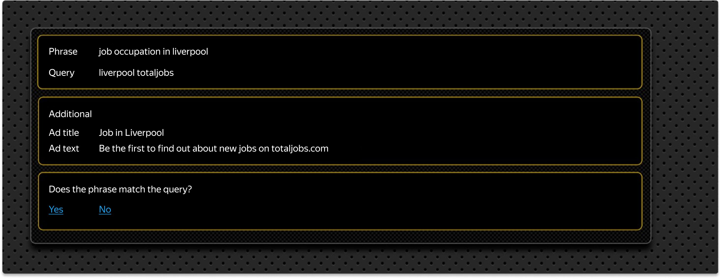
A cross-platform interface must display correctly on both computer screens and mobile devices. As an example, let's take a task where users need to evaluate whether a phrase matches a search query.
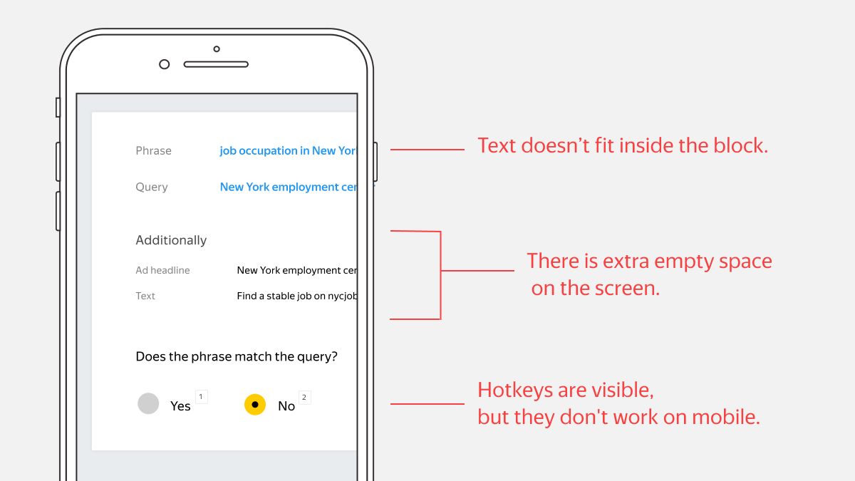
Signs of a poor adaptation:
- Text doesn't fit inside the block.
- There is extra empty space on the screen.
- Shortcut icons are visible, but they don't work on mobile.
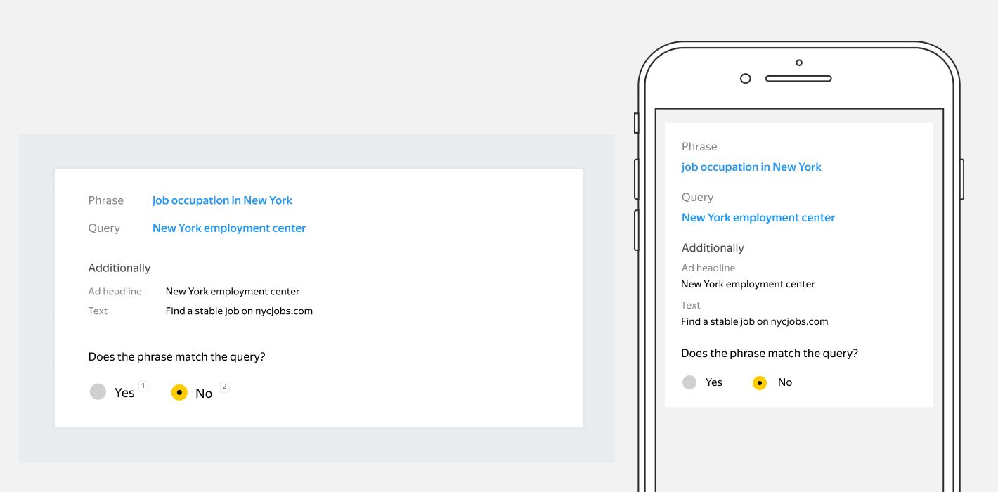
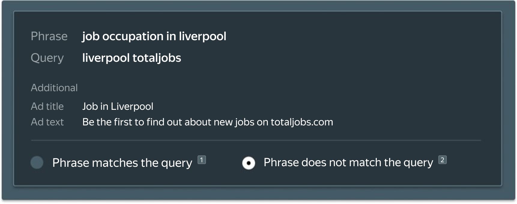
The task displays correctly in both the web version and the mobile app.
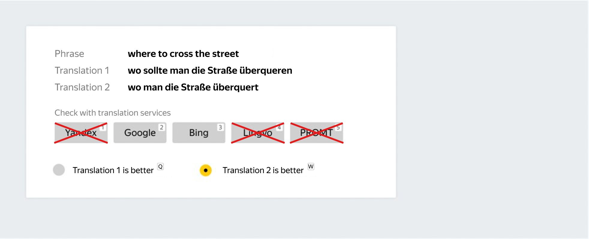
Rule No. 2 Shortcuts
Add keyboard shortcuts. They speed up task completion on computers. We have found that if a task has shortcuts, about one third of performers will use them. You can assign them for anything — not just for setting verdicts, but also for actions like playing or pausing a video. Be sure to describe the keyboard shortcuts in your instructions or display them in your interface so users know about them.
Let's look at a task that can be performed without a mouse. The task involves evaluating the functionality of browser games.
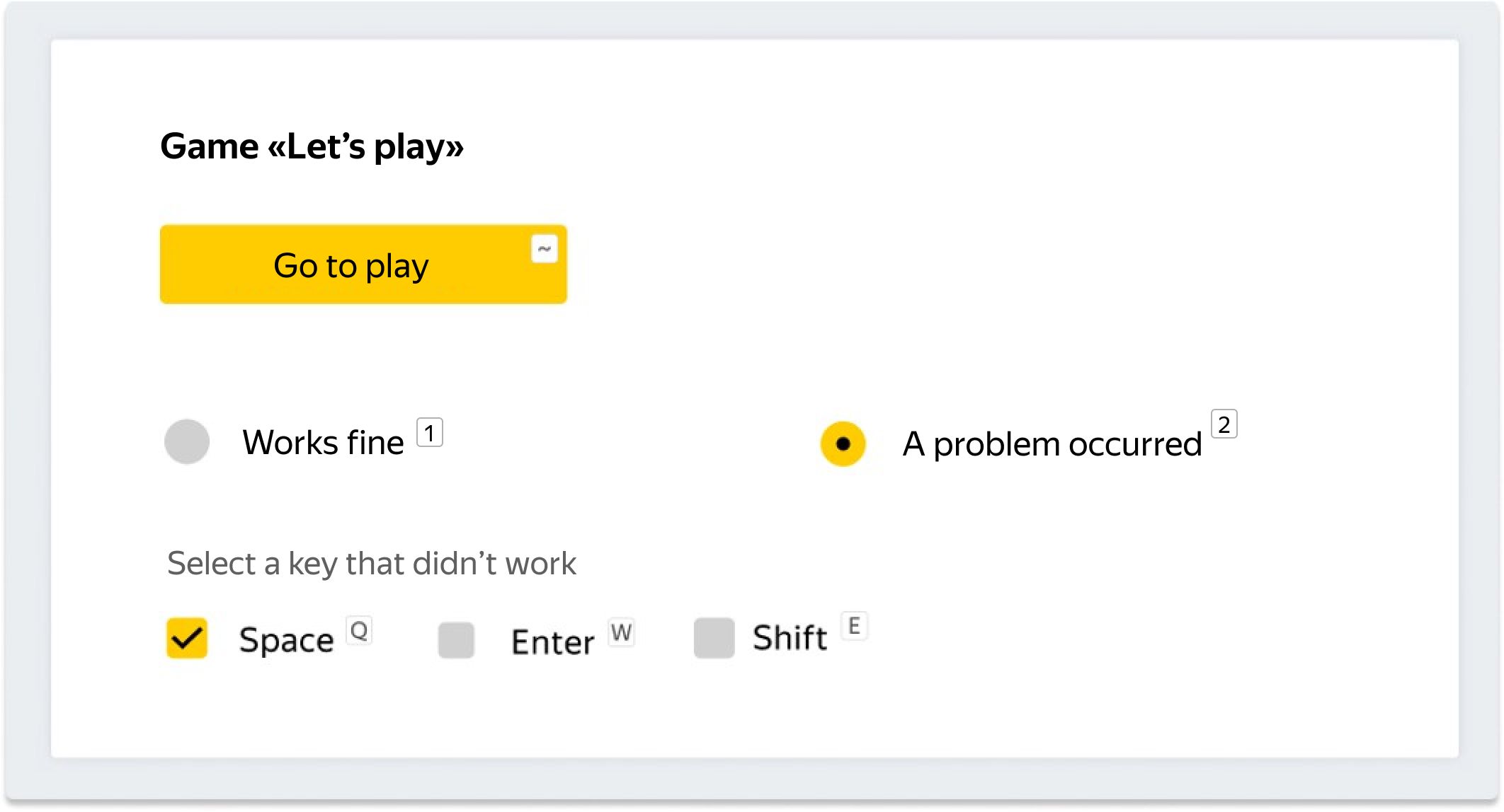
Steps to complete the task:
- Use the ~ key to open the game in a new tab.
- Check whether it works correctly.
- Use browser shortcuts to go back to the task tab.
- Use the keys 1 or 2 (as well as Q, W, and E) to select the verdict.
- Press Enter to submit the task.
Rule No. 3 Check required actions
Since users will be trying to submit tasks as quickly as possible, you need to make sure that they in fact perform all the actions required in the instructions. Configure this verification in the interface.
For example, our game evaluation task cannot be submitted without following a link to the game page.
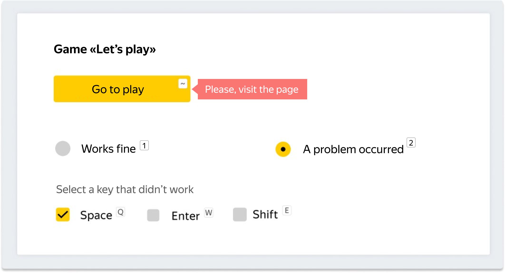
However, it is important not to block performers acting in good faith. In certain cases, it makes sense to disable verification. For example, in a task with audio files, you can check that the file was played, but don't check it if the recording doesn't load.
Rule No. 4 Minimize actions on external resources
It is best to minimize user interaction with external resources. It is difficult to check whether the performer has completed required actions on a third-party site. Additionally, there is a chance that these external resources may simply stop working. If you must use third-party sites:
- Show the necessary information directly in the task (for example, in a screenshot).
- Copy data to your own storage that has guaranteed stability
- If visiting the resource itself is necessary, check that the performer has actually followed the link.
- If the task involves collecting data, check whether the data was collected.
- Add the evaluation option "Not available" in case the resource doesn't open.
Rule No. 5 Don't experiment with design
We do not recommend using an experimental design, even if you have a high opinion of it. If the interface elements interfere with actions or distract performers, they will get frustrated and abandon the task. They may leave negative feedback, which will affect the project's rating.
Example of an experimental design with a dark theme:
Problems:
- Unnecessary division into blocks.
- Bright yellow frames.
- All the text is in the same font, without highlighting important parts.
- Two patterns are used for the background. We do not recommend using patterns in tasks.
- There is a large empty space in the right part of the block.
- Verdicts use a non-standard format that makes them look like links, though they are essentially options.
If you eliminate these main problems, the dark design will look like this:
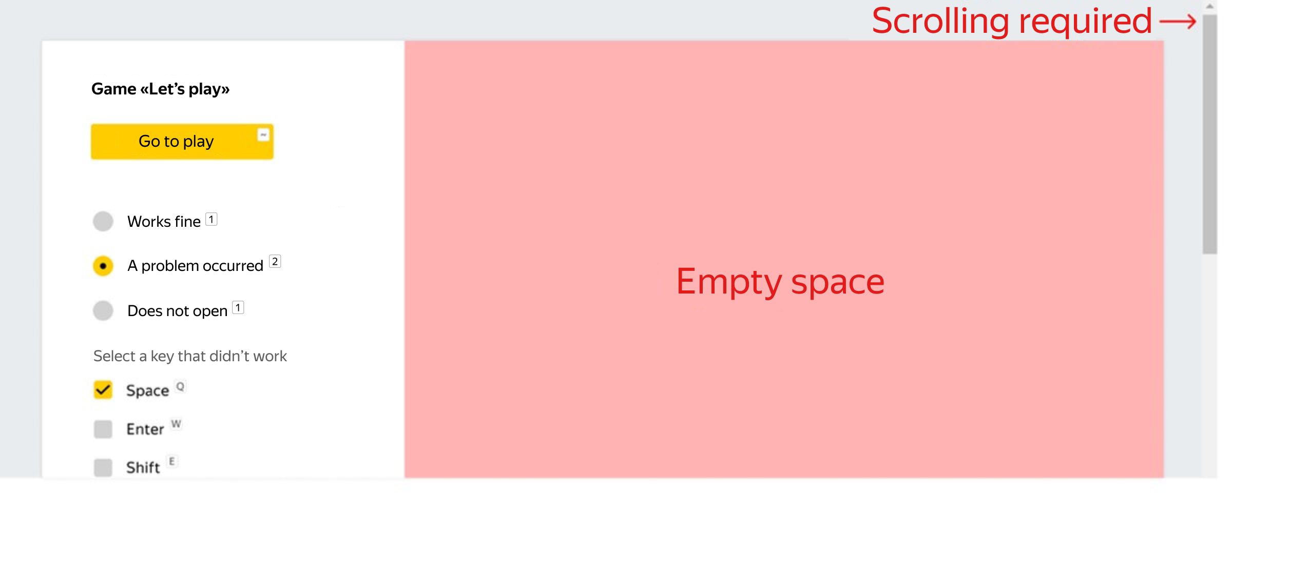
Rule No. 6 Use space effectively
Our tips for effective placement of blocks:
- Elements that are logically related, like checkboxes that answer the same question, should be placed near one another.
- Avoid large blank spaces inside the task block.
- The most important information should stand out visually. Less important information can be hidden or included as a popup tooltip.
If you arrange elements vertically, it will create empty space and add a scroll bar.
Rule No. 7 Just the essentials
The presence of elements like buttons, links, images, and labels must be justified by the task and assist the user.
Example: A task for evaluating translation quality. The instructions advise performers to be guided by their own knowledge and to use online translation services only when doubt arises.
Too many extra buttons. Performers will use a couple of translation services at most, or none at all. Extra buttons can be removed or turned into small icons.
Rule No. 8 Easy-to-use task page
You can place more than one task block on a single page. When creating an interface, it is important to visualize what the page will look like. Keep in mind that having too much information displayed on the screen can be tiring and demands more effort from the user.
Bad interface: blocks of different widths, extra empty spaces, too many tasks on one page.
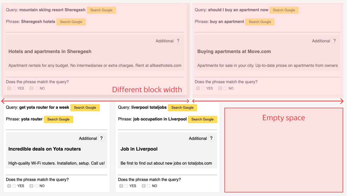
Our advice:
- Make task blocks the same width.
- Avoid empty spaces between blocks.
- Show no more than two or three tasks in one row.
Rule No. 9 Testing
Before launching a task, you need to test it. For a minimal check, you can use the preview mode. Insert data into the table or upload it as a file, then complete and submit the tasks. Double check that:
- There are no problems with the layout.
- The shortcuts work.
- Required steps are verified (like checking that users have followed links and played media files).
- The task cannot be submitted without a verdict or with required fields left blank.
Final checklist
For a successful launch, we recommend going through the following checklist:
- The interface is responsive and displays correctly in both the app and web versions of Toloka.
- The shortcuts work.
- Required actions are checked.
- Tasks with external resources include the verdict "Doesn't open."
- There are no experimental designs.
- In the web version, each task can be completed without scrolling.
- There aren't any unnecessary interface elements.

Recent articles


Have a data labeling project?
