Instructions
What seems obvious to you might not be clear to everyone.
Write concise and comprehensive instructions.
Subscribe to Toloka News
Subscribe to Toloka News
- Crowd contributors (Tolokers) have a variety of backgrounds, so don't assume that your task makes sense to everyone. The quality of the instructions will directly affect the quality of the results.
- Even when the task is poorly designed, clear and comprehensive instructions may save it and provide the help Tolokers need.
- Tolokers look at the instructions when selecting tasks. Most people avoid tasks with poor instructions. If your instructions are easy to follow, more people will choose your task and labeling will go faster.
Examples

Good instructions
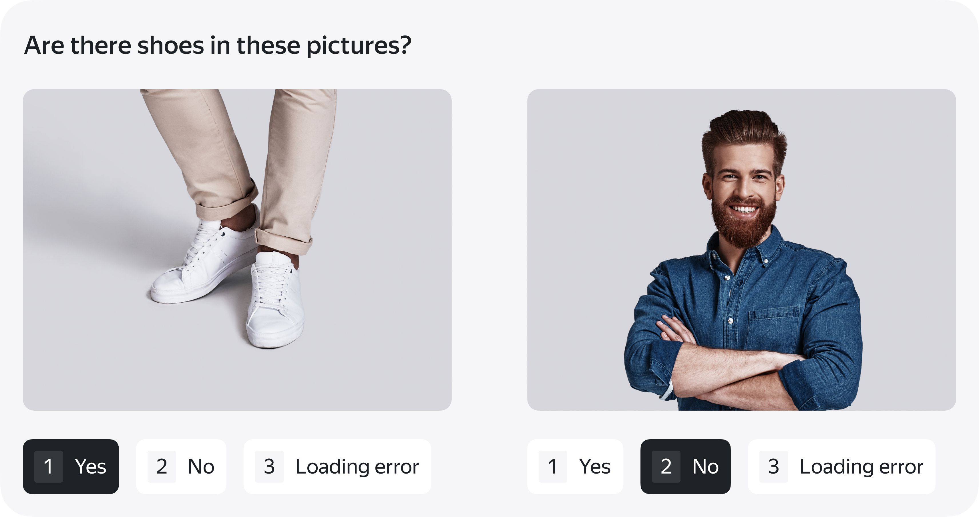
In the task, you'll see photos of different people. You need to look at the picture and decide whether you can see the shoes that the person is wearing.
How to do the task
Look at the image carefully. Choose one of the answer options.
If you can see shoes in the picture, choose Yes. If you can't see shoes in the picture, choose No. If there is no picture or if there is an error, choose
Loading error.
Click the image to enlarge it and view it better. If the image is sideways or upside down, use the Rotate button.
Skip any tasks where more than half of the images didn't load.
If you are using a desktop computer or laptop, use the hotkeys 1, 2, 3, and arrows.
Bad instructions
Classify the photographs that you see into two categories; those in which people are wearing shoes and in which they aren't.
Structure is key
If the instructions aren't structured enough, they are hard to understand. We suggest the following structure:
- Introduce the goal
How will the data be used? What products will it influence? Even a brief description makes Tolokers care more about the task and helps them make decisions in complicated cases. - Define the rules
Who gets access to the task? Is there a training session? Which quality level is acceptable? Are there any bonuses? Tolokers prefer predictable projects with clear arrangements. Plus, knowing about quality control and extra rewards will motivate many of them to perform better. - Clarify technical issues
If the task requires special settings on the Toloker's computer or smartphone, provide clear instructions about that. Remember that Tolokers have varying levels of technical ability. - Explain the task interface
If the task has hotkeys, make sure to list them. Optionally add a screenshot that highlights the buttons and tools. Skip this step if the task has a simple interface. - Describe the steps
Write a step-by-step description of the task scenarios the Tolokers might go through. We strongly recommend that you try out some tasks while writing the instructions. You might come across unusual cases that you weren't aware of. - Add some examples
Real-life examples are necessary and should illustrate all possible scenarios. - Answer questions
Add a FAQ with important hints that don't fit in the sections above and update it later with questions submitted by Tolokers. A small glossary is always a good idea, too.
Tips
Structure
• The instructions shouldn't be longer than 2 screens. If they are, this might mean the task needs to be decomposed.
• There shouldn't be more than 3 heading levels within the task instructions.
• There shouldn't be more than 7 subheadings on each level.
Text
• Each paragraph should cover a single topic. Each sentence should cover a single point.
• If you need to use special terms, define them when first mentioned and use them consistently. If there are a lot of terms, a small glossary might help.
• Avoid slang and professional jargon, even if your colleagues use it every day.
• Avoid placing extra remarks in parentheses, because they tend to overload the text. If the remark is valuable, it's worth adding a separate sentence.
Formatting
• Use only as much formatting as needed to highlight the key points. Too much bold or italic makes it difficult to focus on what's actually important.
• Lists are always good.
• So are tables.
Illustrations
• Don't add pictures just for the sake of having pictures. Too many illustrations will be distracting and make it harder to understand.
• If there's a real need to add a lot of illustrations, it's better to hide them in an expandable section.
In Toloka, instructions can be formatted using a visual editor or HTML markup. Learn more about creating and editing this section in the docs.