Interfaces
Design your project to make it easy to perform the same repeated actions quickly, while reducing mistakes.
Subscribe to Toloka News
Subscribe to Toloka News
The task interface is a tool for the crowd to label your data. The more convenient and helpful it is, the less opportunities there are for mistakes. In general, crowdsourcing task interfaces should adhere to the principles of good UX design. When planning out your interface, always consider the viewpoint of Tolokers:
- They have access to many tasks and choose the ones they want to do
- Most tasks are monotonous and involve repeating the same actions
- Their earnings depend on the amount of tasks done, so they are motivated to perform fast
- Loss of concentration leads to mistakes
Here are a few principles of friendly task design:
Provide a cross-platform interface
Users access crowdsourcing platforms from computers, tablets, and smartphones. If a task is displayed correctly on all devices, more people will see it and complete it. To adapt the task interface to different devices, make sure that texts fit on the screen, there isn't unnecessary empty space, and so on.
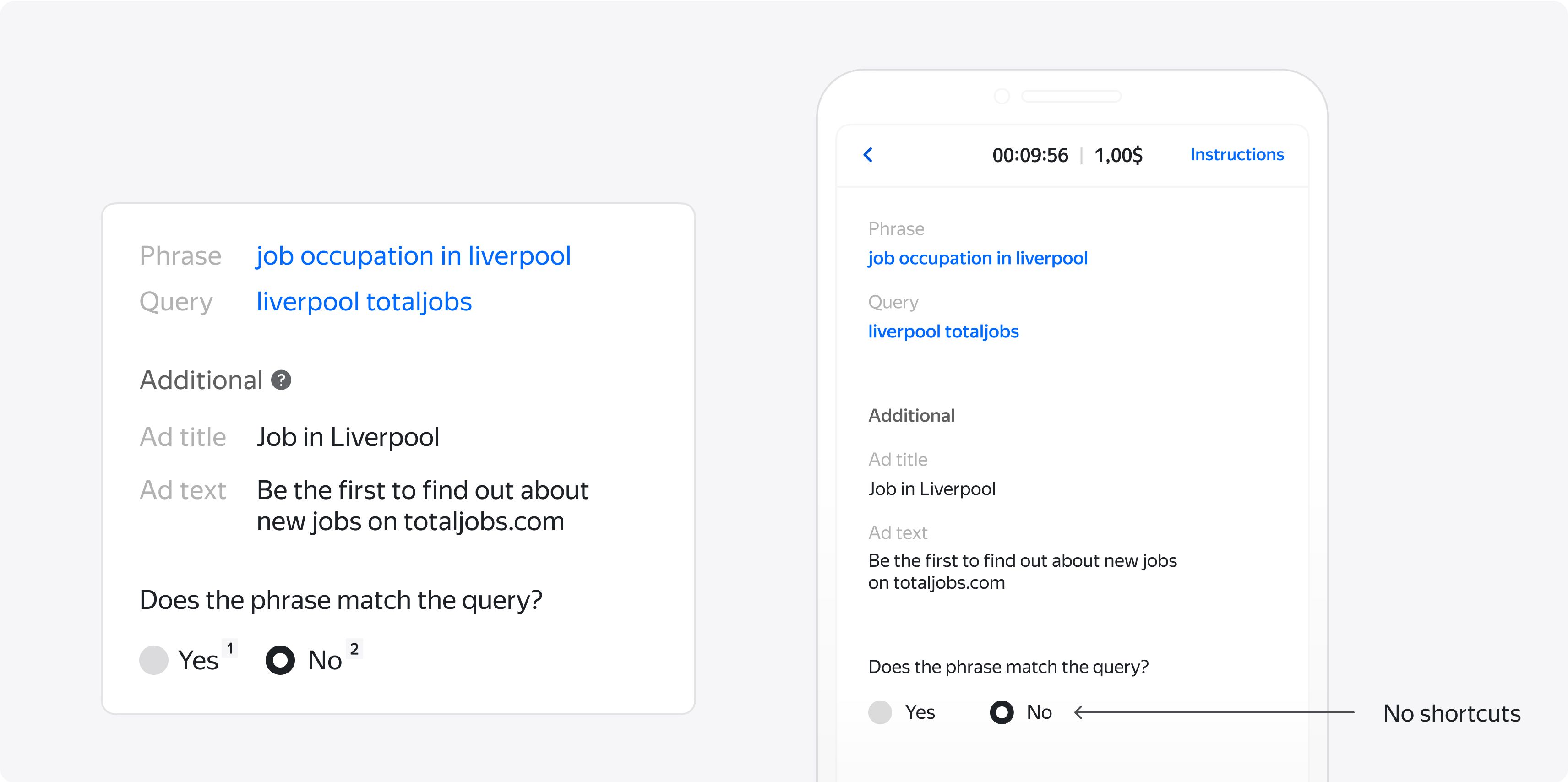
However, not all tasks work well as cross-platform solutions. Tasks that involve complex manipulations on the screen, loading videos or displaying media content might not work well on different devices or will demand too much traffic. It's better not to include mobile access for these types of tasks.
Provide keyboard shortcuts
Shortcuts can be assigned for any action - choosing an answer, playing or pausing a video, or opening a link. The simplest tasks can be completed exclusively on the keyboard, which helps people complete them much faster. If the interface supports shortcuts, describe them in your instructions or display them in the task interface.
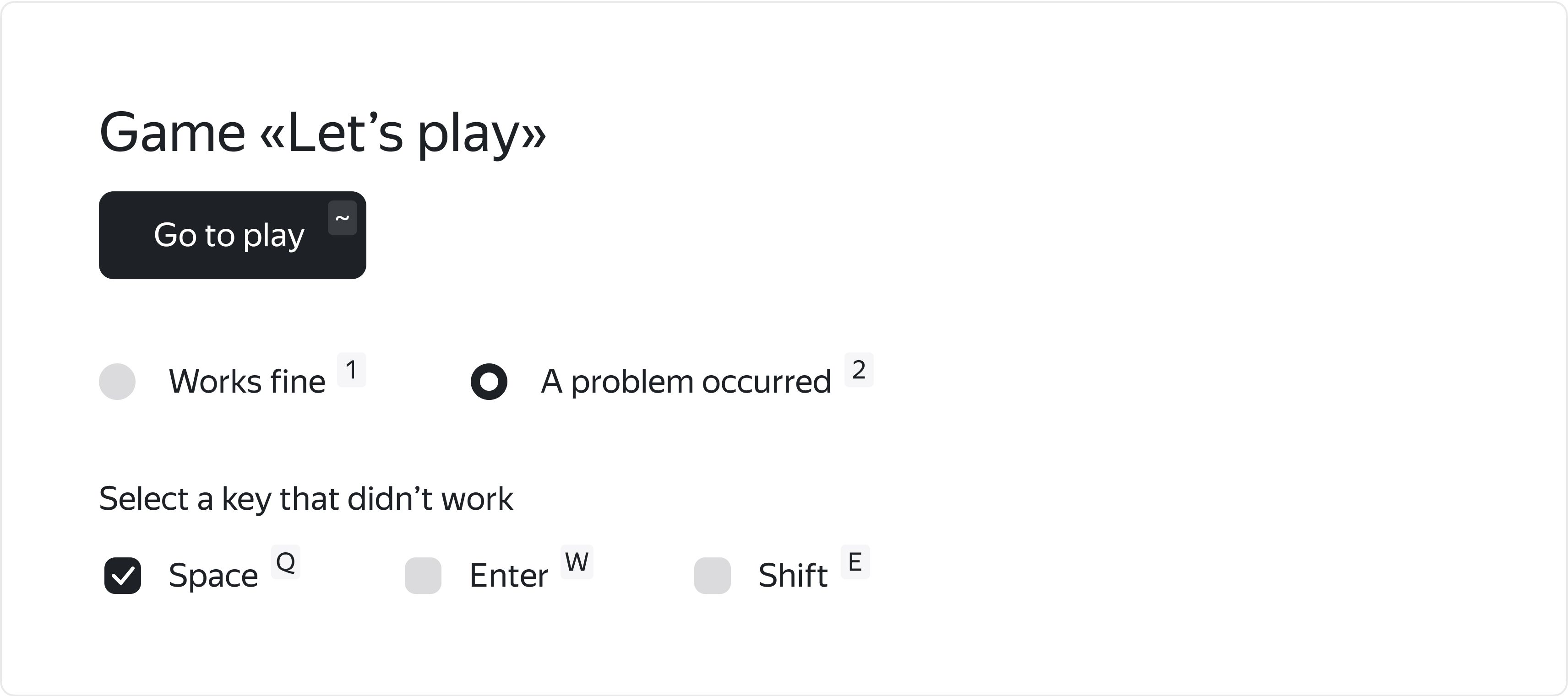
But don't forget to remove shortcuts for mobile interfaces. They won't work and they'll just take up precious space on the mobile screen.
Check required actions
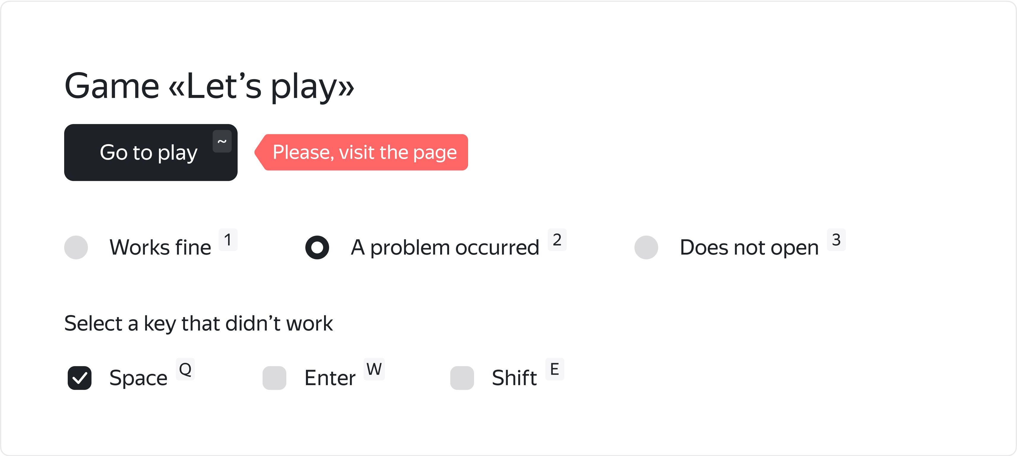
Tolokers usually work fast and might skip important steps, either accidentally or intentionally. Since a task interface is basically a web page, you can check for required actions using Javascript methods. If a task involves watching a video, visiting a link or typing in a text, it's a good idea to disable the task submit button until the required action is done. Recording user actions is another way to control quality. Learn more about quality control).
Eliminate interaction with external resources
Navigating through external resources takes additional time for loading the page and can distract the Toloker from tasks. It is also inconvenient for you, as the requester, because you can't track what the Toloker is doing on the external page. It's better to use a screenshot or a copy of the data saved in stable storage (like cloud storage), or at least integrate external pages via an iframe.
Strive for minimalistic design
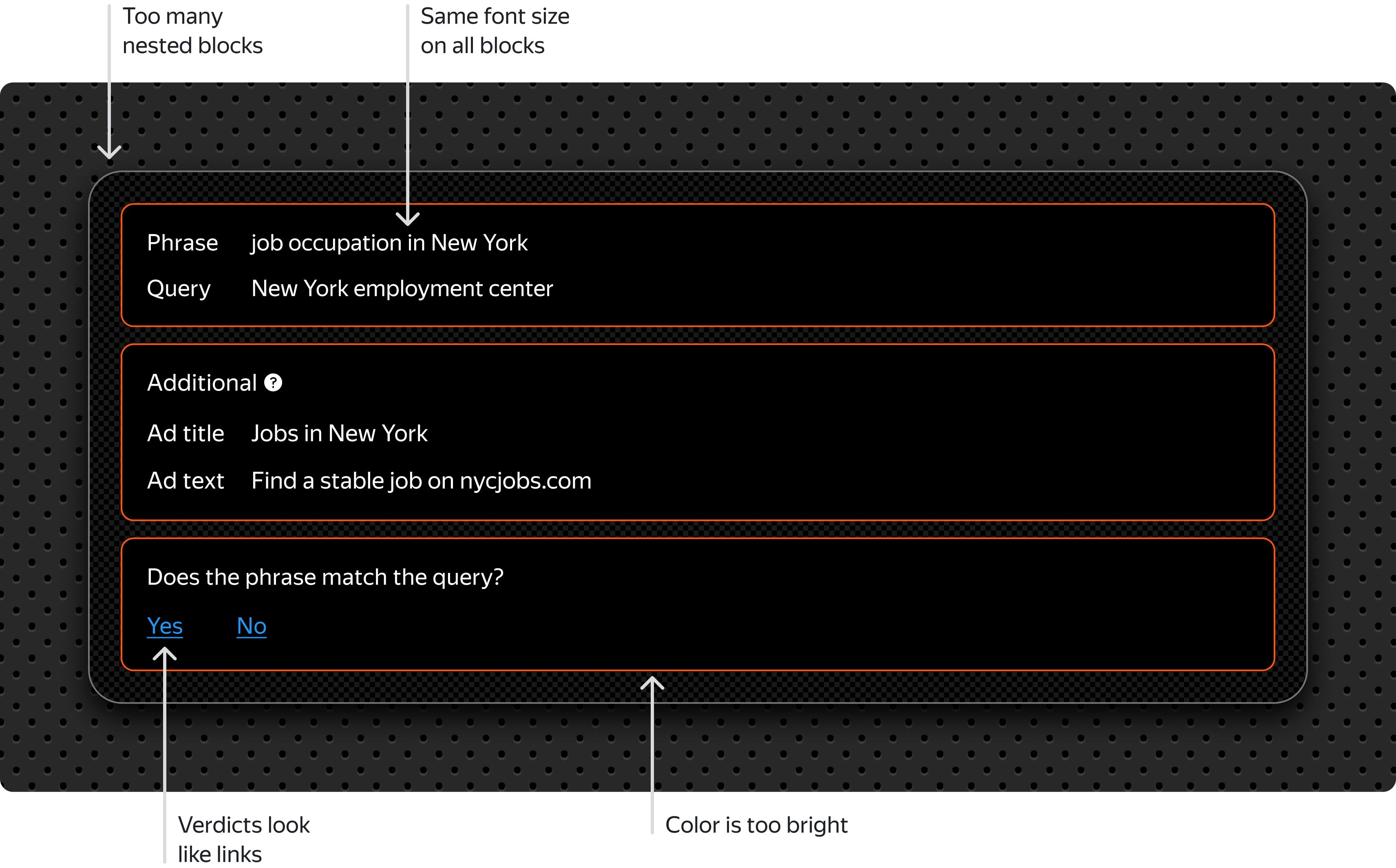
It's always better to strive for minimalistic design to prevent fatigue. Tolokers might get tired of excessive colors and textures while working on a long flow of tasks and lose their focus.
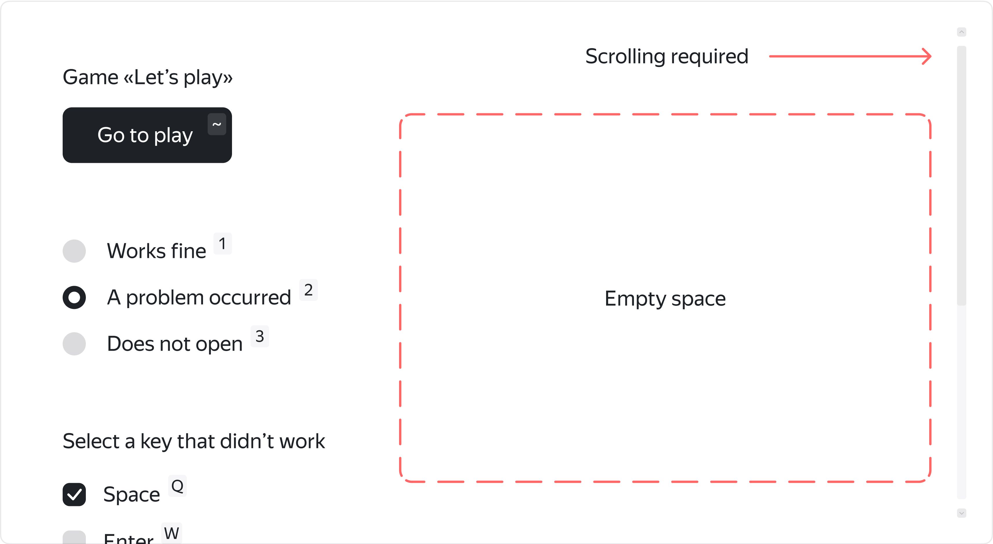
Use space reasonably
Make sure everything fits within the area of one standard monitor screen. This allows Tolokers to evaluate tasks without scrolling. Any elements that are logically related (like checkboxes) should be grouped together. The most important information should stand out visually. Less important information can be hidden or displayed as a popup tooltip.
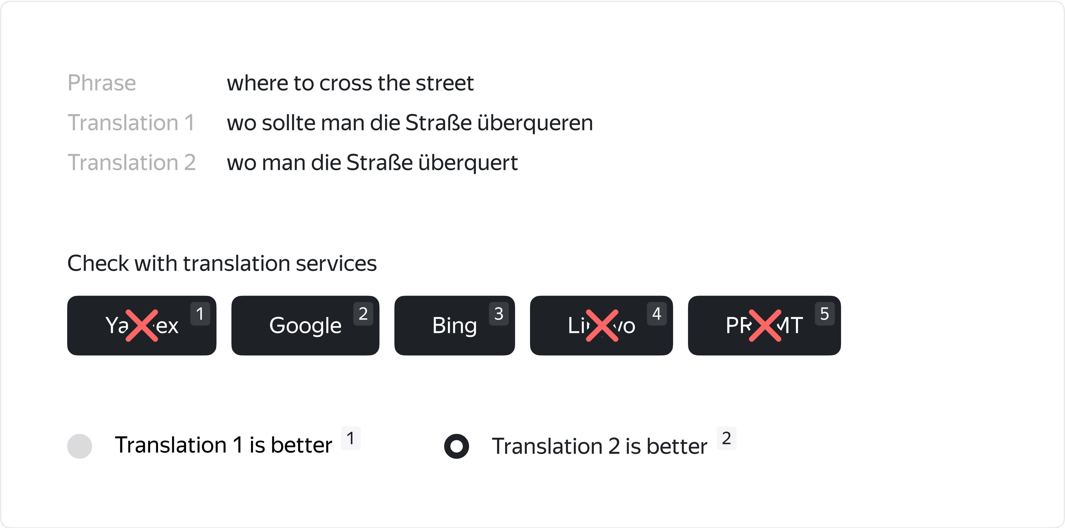
Remove excessive elements
All the interface elements should be actually necessary for the task. It can be tempting to add extra reference links to different services, but it's better to decide which ones are really helpful and remove or reduce the size of others.
Test the project
Just like with any web project, make sure that everything works as planned before you launch the project.
- Template Builder: use this tool to create interfaces from off-the-shelf components adapted both for desktop and mobile.
- Interface Editor: separately configure HTML, CSS and JS blocks. Be sure to use special components and helpers for the HTML block as well as the JavaScript extensions, both described in the docs.